

︎Jan︎ is a type family designed digitally for exclusive use by ︎Doma Books︎ It consists of two styles —upright and italic— and features Greek monotonic and polytonic character sets as well as small capitals, in order to serve every typesetting need. *Jan* also features an extensive Latin character set as well as all the necessary figure styles, a full set of punctuation marks, symbols, arrows and some typographic ornaments.


Claude Garamond’s name is firmly associated with France’s rise to leadership in type casting in the sixteenth century. Jan’s upright Latin drawings are based on the French engraver’s famous typeface models, while the italics are based on types designed by his contemporary Robert Granjon. The Greek character set, however, is not based on Garamond’s infamous Grecs du roi, but rather are modern designs, loosely inspired by classic models of Greek typography: the upright from *Elsevier* and the italic from *Leipzig* ¶ The name *Jan* is a tribute to Jan Tschichold, the German typographer who played a fundamental role in the development of modern graphic design in the 20th century and, in the 1960s, designed *Sabon* —a revival of Garamond— which was used by ︎Doma Books︎ before Jan was created.

A few –out of context– Kierkegaard aphorisms, set in ︎︎︎Tependris Regular︎︎︎ a custom typeface, based on Konstantin Kakanias’ distinctive lettering style.


︎︎︎Tependris Regular︎︎︎, a typeface designed exclusively for the book ︎ Mrs Tependris – A life in Vogue Greece ︎ by ︎Konstantin Kakanias︎, published by ︎Kathimerini

Massimo Vignelli’s “five fonts idea” is a famous design philosophy advocating that a designer only needs a very limited selection of high-quality, classic typefaces to create effective, timeless work. Vignelli argued that the massive proliferation of typefaces was “visual pollution” and that designers should focus on mastery of a few, rather than experimenting with thousands. ¶ ︎︎︎ MOROS ︎︎︎ stands on the opposite to Vignelli’s idea. It is not a joke. It is a reverse blood dripping grotesque typeface. Because, sometime, a designer may need it.


︎︎︎HYDRO︎︎︎ is a geometric typeface designed for ︎ EYDAP’s Historical Archive ︎ The starting point for its study and design was the rich material included in the Archive: a series of technical and construction plans and diagrams, which reflect the diligence, precision and technique of the engineers of the 1930s.

Detail from the Marathon Dam’s blueprint legend, showing the lettering that was the reference for the design of HYDRO.
︎“Mechanical” letters
The letters in the legend of the Marathon Dam blueprint are hand drawn, not printed. Their texture testifies the method of their drawing – the traces of the outlines as well as their fill. India ink, technical pen, ruler and compass. They are letters made with the simple mechanical means of the time.
Lettering was an essential skill for a draftsman, for presentation of a complete technical drawing. The standard styles of lettering used on this type of drawings are geometric, created with the ruler and compass; form is defined by the tools used.

Various models of lettering, from drawings in the collection of EYDAP’s Historical Archive, 1930s.

Looking for corresponding typographic examples from the same time period, one finds that examples such as those pictured here have an aesthetic affinity with the lettering used on the technical drawings. These are also products of the Modernism era and belong to the grotesque category, they are low contrast fonts, without serifs. They are designs that also reflect the ruler and the compass rather than the calligraphic pen and handwriting.

The engraved inscription from the effigy of the The Athenian Treasury at Delphi, which was built at the base of the Marathon Dam. Source: EYDAP’s Historical Archive.
In Greece, during the 20th century, grotesque typefaces were usually called ︎ archaic ︎. Perhaps because their creators discerned in them a connection with the ancient epigraphic letters that have been preserved engraved on stone – perhaps, simply, because they considered them simplistic, compared to the calligraphic Byzantine ones. Be that as it may, the geometric model of the Greek letter survived – at least in inscriptions – until the 20th century, in multiple variations and in many applications, as its simple, geometric forms make it suitable for use, both in neoclassical and modern architecture.
︎The mechanics of typography
In typographic design there are “behind the scenes” processes that are meant to trick the eye, visual corrections that are made to bring consistency and uniformity to the entire alphabet. Part of designing typefaces is managing this eternal friction between geometric fidelity and visual relevance. Absolute dependence on mathematical measurements is abandoned. The horizontal, vertical and diagonal strokes are not of equal thickness, although they appear to be. Circular and triangular forms are drawn slightly larger than squares in order to appear equivalent in volume.
All these features are not found in the lettering models of the mechanic’s technical drawings. This is obvious if we compare the two most characteristic examples of the modernist period: Herbert Bayer’s Universal Alphabet and Paul Renner’s Futura typeface. Both are turning points in letter design, but Renner’s typographic designs are the ones that, due to the optical corrections, look correct and are the ones that have retained their power to this day, still being used extensively in modern typography.

Herbert Bayer's designs for his Universal Alphabet, 1926.

Image from the first specimen book of the typeface Futura, 1927.

The inscription at the base of Trajan's Column, Rome,
113 AD
︎ Rhythm and proportions
Typography is a game of black and white. The unified image of a body of text is determined by the individual proportions of the letters and a smooth reading pace is achieved through those harmonious proportions. This issue has concerned designers for centuries.
It is generally accepted that one of the best models of capital letters are those carved on Trajan’s Column in Rome. Observing these letters, one can see that they can be divided into two categories, according to their width: some are wide and some are narrow. By following this specification, we can ensure a correct pace in reading the text, without visual glitches in our composition.

The separation of the alphabet by width, in the Trajan typeface designed by Carol Twombly in 1989. Above the wide letters, below the narrow ones.
By observing the letters in the EYDAP blueprint legend, one finds several “dissonances” in terms of their width. The mechanical letters of the technical drawings tend to be drawn inscribed in a square, which results to a visual imbalance, as well as in the reading rhythm. Rho is a typical example. In the image on the right, above, we see the original form, while below the form it should have – at least in a font that favors smooth reading.

Above: the original form.
Below: the ideal form.
︎The lowercase letters
In addition to rationalizing the capital letters of a font, and in order to be suitable for use at small sizes, for long texts, lowercase letters are also required. For the Greek alphabet, the two most prevalent reference models of the past in the category of sans serif fonts are Gill Sans (made by the design studios of Monotype) and Olympia (a Greek variant of the very popular Latin Futura), with the latter having the greatest affinity with the capitals of our sample. The rigorous evaluation of these models, combined with the tools of modern font design technology, constituted the two main pillars in the design of HYDRO.

Above: Gill Sans Greek Upright 572, from a Monotype specimen.
Below: Olympia in a specimen from the Karpathakis type foundry.
Source: Archivesofdesign.gr

︎A new typeface
HYDRO is a geometric sans serif typeface, designed in three weights: regular, medium and bold – a basic set that can support quite complex publication needs.

The typeface was digitally designed and fully supports the Greek monotonic character set. It also includes a Latin character set, figures, symbols, punctuation marks and accents, making it suitable for use with any European language that uses the Latin alphabet. In addition, the letterforms of the original design were retained as stylistic alternatives for use at large sizes.


The typeface was designed in 2022 and was produced by the ︎ EYDAP’s Historical Archive ︎ , with art direction by ︎ Christopher Brelis ︎
It is available for download ︎ here ︎ under the SIL Open Font Licence.

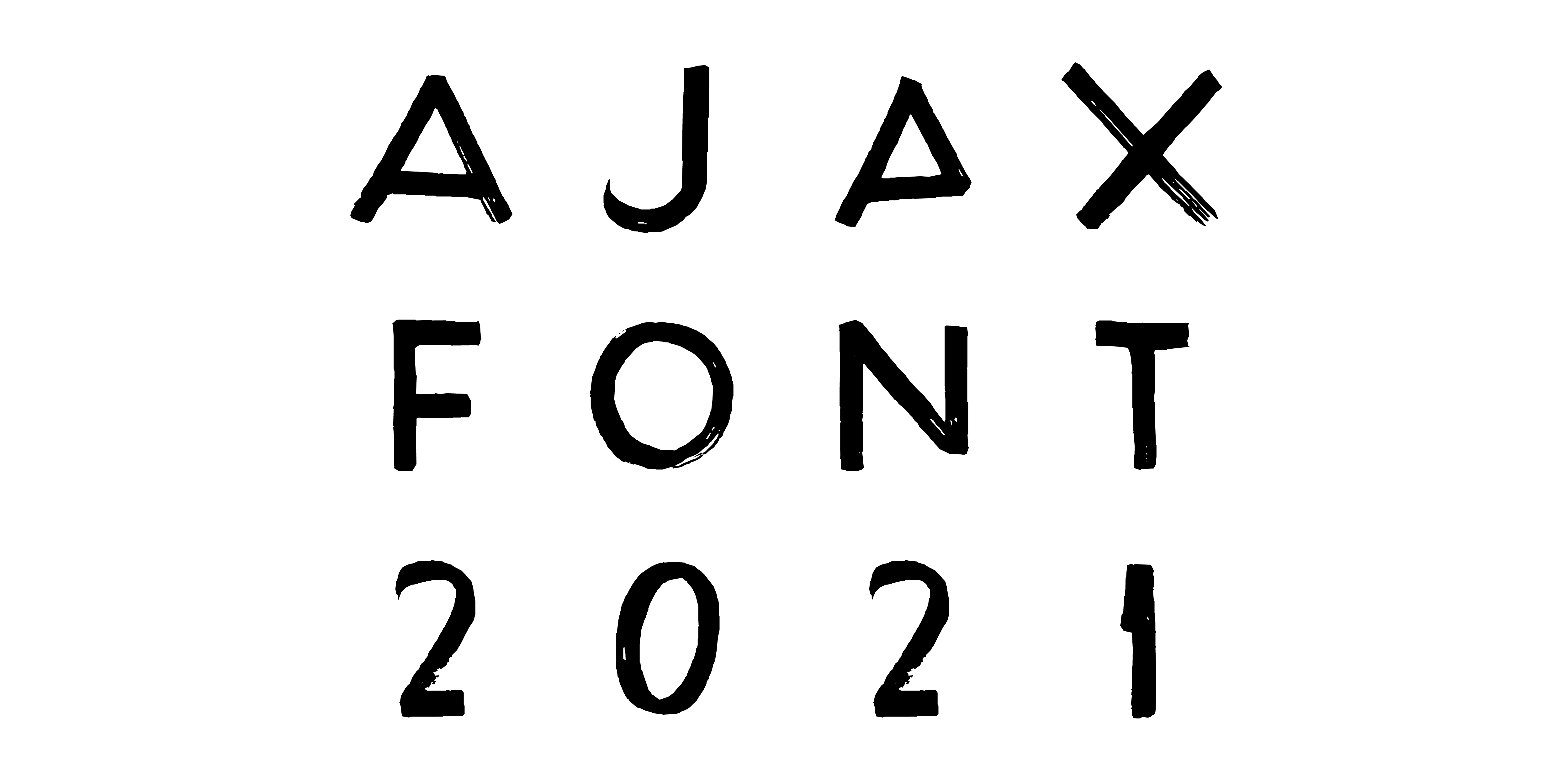
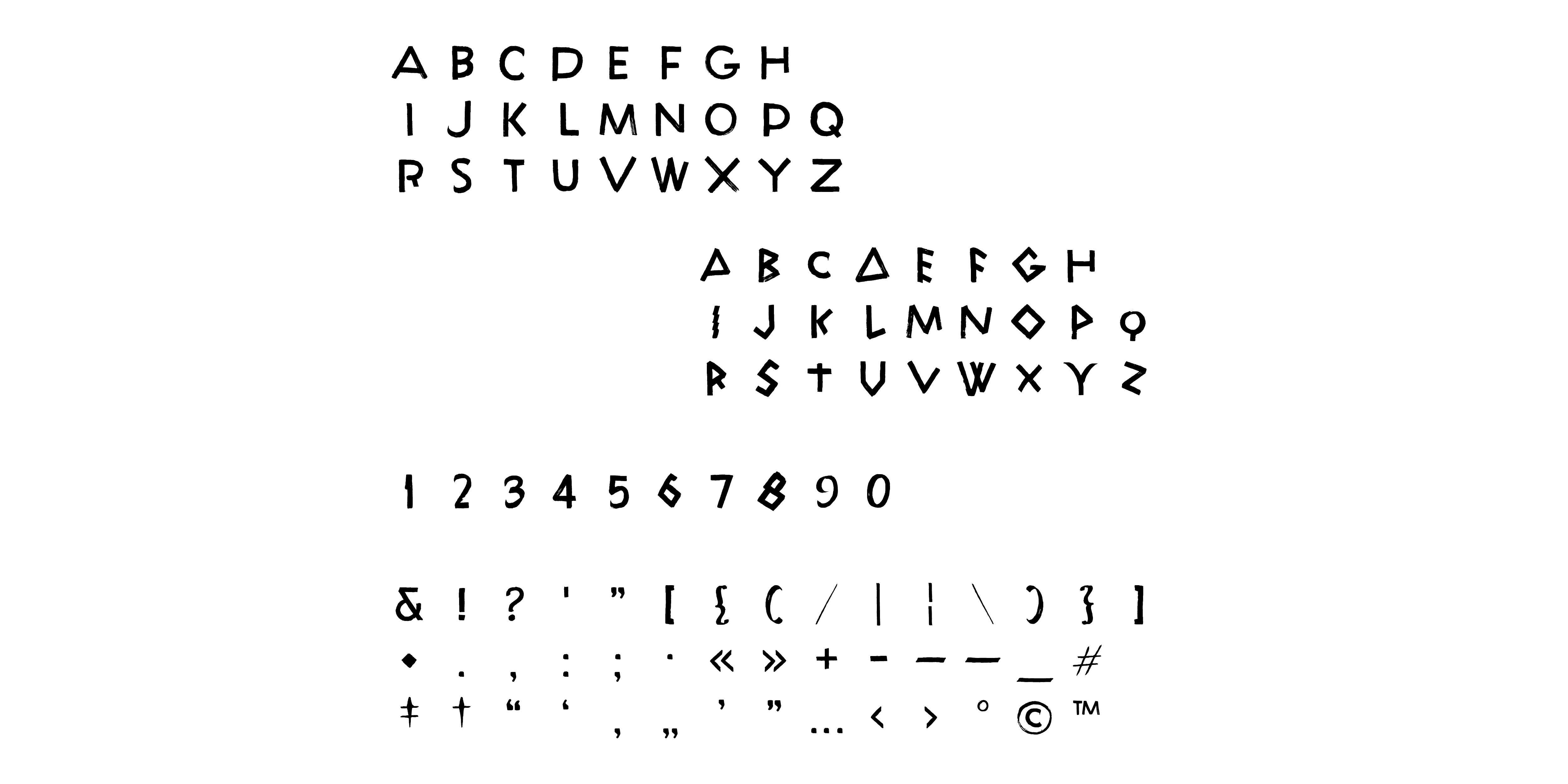
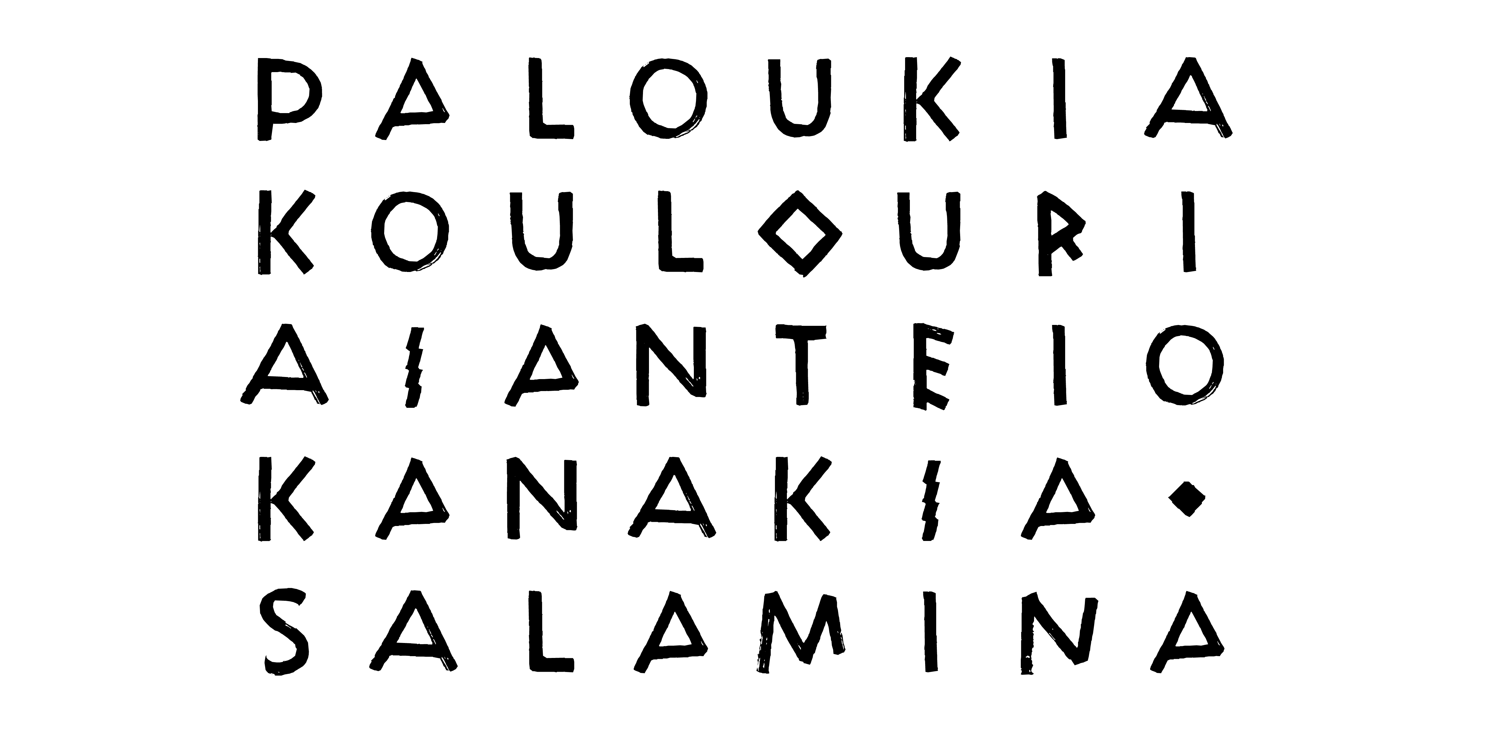
︎︎︎ AJAX ︎︎︎ is a Latin monospace display typeface. The forms of the letters, roughly painted with a flat brush, are inspired by Ancient Greek models. The typeface was designed on demand for ︎The Stimuleye︎ to be used for the opening titles, the chapters introduction and the end credits of the film I WANT, a durational performance & film collaboration by ︎ Antoine Asseraf ︎ René Habermacher and ︎ Lynsey Peisinger
This is a promotional poster ︎︎︎
